
Images in this archived article have been removed.
If it looks like a duck, and quacks like a duck, we have at least to consider the possibility that we have a small aquatic bird of the family anatidae on our hands
—Douglas Adams
Dr. James Hamilton (JDH) recently released his study Causes and Consequences of the Oil Shock of 2007-08. The paper concludes that if the oil price shock that started in 2007 and ended after 2008:Q2 had not occurred, the U.S. economy would have been described as growing slowly in 2007:Q4-2008:Q3. Here is JDH’s conclusion and the main result (Figure 1).
Eventually, the declines in income and house prices set mortgage delinquency rates beyond a threshold at which the overall solvency of the financial system itself came to be questioned, and the modest recession of 2007:Q4-2008:Q3 turned into a ferocious downturn in 2008:Q4. Whether we would have avoided those events had the economy not gone into recession, or instead would have merely postponed them, is a matter of conjecture. Regardless of how we answer that question, the evidence to me is persuasive that, had there been no oil shock, we would have described the U.S. economy in 2007:Q4-2008:Q3 as growing slowly, but not in a recession.

Figure 1 — “The green dotted line is the forecast if we ignored the information about oil prices, while the red dashed line is the forecast conditional on the huge run-up in oil prices that subsequently occurred. The black line is the actual observed path for real GDP. Somewhat astonishingly, that model would have predicted the course of GDP over 2008 pretty accurately and would attribute a substantial fraction of the significant drop in 2008:Q4 real GDP to the oil price increases.” See Consequences of the Oil Shock of 2007-08 or the original paper cited above. Based on Hamilton’s model What is an oil shock? (2003).
Hamilton is making a subtle point by examining a counterfactual proposition. Imagine there had been no oil shock in 2007Q:3-08:H1. In this case Hamilton believes that the U.S. economy would have been “growing slowly” during the period in question. This point is confusing because our economy was growing slowly as measured by real GDP (+0.7 or 0.8 percent as shown in Hamilton’s Table 3, and discussed on page 34). JDH’s point is that without the oil shock, our economy would have been seen as growing at a slightly faster rate than the data shows—declining light truck sales provide empirical support for this view (see the last section below). Hamilton says his conclusion is one “that I don’t fully believe myself.”
The NBER finally declared a recession in December, 2008, but many economists had made the call long before that. First out the gate was Calculated Risk, who declared the downturn in March based on a correlation between recessions and new home sales. In an informative post Gross domestic income (GDI) and recessions, JDH discussed Jeremy Nalewaik’s analysis of how the economy was faring in 2008 (September 28, 2008). Based on the GDI, which differs from GDP by only a statistical discrepancy, Nalewaik’s model “unambiguously” signaled that the U.S. economy was in recession based on the 2007:Q4-2008:Q2 results. On October 30, 2008, after the negative 3rd quarter result was in, JDH’s recession indicator index was not officially calling it a recession yet, although he said “you could easily call it either way.”
It seems to me that JDH has gone out on a limb in assuming real GDP growth in 2008:Q1-Q2, which are the only two positive quarters in the last five—a limb that could easily be sawed off when the final “final” numbers come in. I believe that the U.S. economy was shrinking throughout 2008. In fact, there is evidence that the oil shock actually inflated real GDP growth in 2008:H1.
My doubts about Hamilton’s story begin—and mostly end, actually—with BEA measurements of real GDP in 2008 and prior years (Figure 2). Did the oil shock make the economy worse in 2007:Q4-2008:Q3? Undoubtedly. Although I am less impressed with the correlation in Figure 1 than Hamilton is, his thesis loses much of its force if real GDP measurements have been distorted by anomalous or new economic events and trends in recent years.
Thus if there is good reason to doubt that the U.S. economy in 2007:Q4-2008:Q3 was growing, it is hard to support Hamilton’s conclusion that the oil shock (as interpreted through his model) was a good predictor for GDP in 2008. I agree with JDH that the oil shock both exacerbated and accelerated the downturn in 2008:Q4.
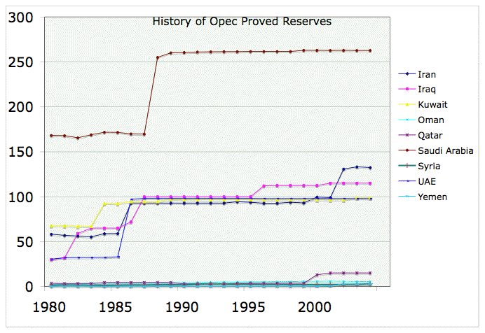
Figure 2 — Quarter-to-quarter real GDP growth as measured by the BEA. Real GDP is calculated by subtracting the GDP Deflator from nominal GDP. Real growth slows after the Housing Bubble collapses starting in 2006:Q2 (based on Case-Shiller). Bucking the trend, we see two strong quarters in mid-2007 and then another in 2008:Q2. You can see the great volatility since 2006:Q2. If someone handed me this chart without telling me what it was, I would immediately conclude that something’s wrong. In this way, it’s like OPEC proved reserve revisions in the 1980’s.
JDH reminds us that real GDP data do get revised. Our economy is not what it used to be, and perhaps what it used to be isn’t what it was. Economic distortions introduced by the Housing Bubble and its collapse, the false wealth effects—now being unwound—introduced therein, the inordinately large profit flows in—and now out of— banking and insurance, the continuing destruction of manufacturing in the U.S. due largely to globalization, a declining dollar from 2005-2008:Q2, and (last but not least) the oil shock following on rising prices since 2003 all cause me to question whether the real GDP measurement can yield a meaningful signal in the face of an onslaught like this.
New circumstances in our economy give us good reason to doubt real GDP measurements in recent years. I couldn’t possibly do the subject justice in a short essay, so I’m going to do some hand waving. I am an energy analyst, not an economist, but I am now compelled to examine these issues, especially because we’re in dire straits in 2009:Q2. I will bring up a few examples and hope that others will do a more in-depth analysis that substantiates (or not) the points I raise.
To get the ball rolling, here is what Michael Mandel said about the economy on July 31, 2008, when the negative 2008:Q3 result and the terrible Q4 result still lay in the future.
I’ve steadily maintained that the economic data overstated the strength of the economy, and today we had the first confirmation. The BEA issued its revision of the past three years of GDP statistics, and guess what? The fourth quarter of 2007 was revised down to negative growth (-0.2% from the previous 0.6%).
In my view, this process of downward revision of the stats for 2007 and 2008 will continue over the next several years. It takes that long for all the source data to catch up (for example, tax return data for 2008 is not available until mid 2009 or even later). By the time that the data revisions are done, it will be clear that GDP growth in the first half of 2008 was negative, despite what the stats say now.
In other words, I believe that the statistics will eventually show that we are in a recession now, no matter what the official data says now.
Let’s start by taking a close look at the 2nd quarter of 2008.
Effects of Trade On 2008:Q2 Real GDP
Whether the economy was growing slowly at an annual rate of 0.7 or 0.8% between 2007:Q4 and 2008:Q3 depends directly on the large positive result in the 2nd quarter and to a lesser extent, the smaller gain in the 1st quarter. The BEA’s advance report in the second quarter showed real growth of 1.9%, raised this number to 3.3% in the preliminary report after the trade numbers came in, and finally settled on the expected 2.8% in the final report. JDH discussed the revisions in Last Quarter’s Fundamentals, where he noted that “a good 0.37 ppts of the -0.5 ppt [final] revision could be accounted for by [personal] consumption.” There were much smaller downward revisions in net exports and investment as well.
Perhaps it is hard to remember now in April, 2009 just how controversial the positive 2nd quarter report was last summer—many did not find it credible. Menzie Chin, Hamilton’s writing partner at Econbrowser, wrote an insightful article on the result in Why Does It Feel Like a Recession? (RGE Monitor, August 31, 2008).
Figure 1 [my Figure 3 below] illustrates real GDP growth in ppts SAAR (blue bars), and the contributions from Net Exports (red line) and Imports (green line)…
Interestingly, the change in trade sectors accounts for almost all of growth (in the advance, it accounted for more than all GDP growth). And while the proportions coming from export growth and import shrinkage are about the same, here I think absolute percentage point contributions are important. Reductions in real imports now are calculated to contribute 1.45 ppts, as opposed to the earlier estimate of 1.26 ppts. Of course, some of this reduction is due to the weaker dollar, as journalistic accounts have stressed. But unlike exports, imports are — according to macroeconomic estimates — highly insensitive with respect to exchange rates, and much more elastic with respect to income. So I suspect that real income is either actually stagnant or falling, or perceived to fall in the near future…
It’s clear [from Chin’s Figure 3] that the amount that we’re expending on (Gross Domestic Purchases from consumers, businesses, and government only) is barely growing; given q/q annualized growth of 0.3 ppts (log terms), it’s essentially zero. So the factories may be humming, but that’s because exports are up, thereby illustrating how much continued growth in GDP depends upon the trends in the rest of the world.
[I will have more to say about on this last point below.]
Figure 3 — Real GDP with contributions from Net Exports and Imports. This graph reflects the preliminary (3.3%), not the final (2.8%) BEA assessment. GDP = C + G + I + (Ex – IM), where these terms represent consumers, government, businesses, and exports & imports. The term (EX – IM) = Net Exports. The term is negative, but a higher (but still negative) net exports value raises GDP while an increase in imports lowers GDP, all else being equal. So, this graph shows that 1) imports shrank, 2) exports rose, and 3) net exports contributed almost all of the growth shown.
Although Chin notes (based on his Figure 2) that “the steep drop-off” in the Net Exports ex oil/GDP ratio “suggests to me a big income (and perhaps wealth) effect”—this is the only reference to oil—he does not mention the huge distortion that the surge in oil prices in 2008:Q2 had on the trade balance and therefore the real GDP measurement. Others, like Jake at EconomPic Data, were not so reticent.
Due to a rise in the price of oil from less than $110 to $145+, the import portion of the GDP Deflator raised Real GDP by 4.6% [based on the preliminary 3.3% report]. This is more than 2x the level seen at any other point during this decade and the highest amount EVER (we have to go back to Q1 1974 and Q1 1980 for levels even remotely close to that of this past quarter [as shown in Figure 4 below].)
Figure 4 — the anomalous contribution of imports to the GDP deflator in 2008:Q2, based on the preliminary BEA report that showed a 3.3% rise in real GDP. You can see 1974:Q1 and 1980:Q1 in the data.[And from here]: So what do we find? Nominal imports increased in Q2 by 18.8% annualized. Real imports DECREASED in Q2 by 7.5% annualized. In other words, even though we paid 18.8% more out of our pockets, we received 7.5% less units of these imports. Why? The Import GDP Deflator decreased imports by more than 25%.
Had we paid the same price level quarter over quarter for our imports, and thus received more given the level of nominal GDP, real GDP would have been -1.3% [when this calculation was made]. I understand this WOULD NOT necessarily be a more accurate version of GDP, but it illustrates the size of the impact/just how odd this calculation is.
We paid much more for imports (e.g. oil & food) so we imported much less stuff according to the BEA. Once the price distortion introduced by the oil spike is adjusted via the deflator, the BEA calculates that the actual quantity of U.S. imports dropped 7.5%, and this decrease contributed substantially to the net exports gain in real GDP (from -462.0 to -381.3, current BEA data) as shown in Figure 3. I want to make it clear that we did not import significantly less oil during the 2nd quarter as this might seem to imply—we just paid a lot more for those barrels.
Paradoxically, the sharp oil price rise gave a large boost to real GDP. That’s one (very destructive) way of getting your trade balance moving in the right direction, I guess.
I don’t see any way to wiggle out of this one—the oil price shock itself contributed substantially to a final 2.8% rise in 2008:Q2 real GDP by lowering our imports just as the weak dollar was supporting an increase in exports. Oil prices also seem to have made a positive contribution to slow 2008:Q1 growth. I believe Chin made the right call when he said “real income [was] either stagnant or falling” in 2008:Q2, and that was likely true in Q1 as well.
Thus if the skyrocketing oil price contributed substantially to slightly positive real GDP growth in 2007:Q4-2008:Q3, the economy might have performed much worse without it! It is very hard to separate causes from effects regarding how the oil shock affected growth.
This oil price surge may explain the descrepancy between the GDI and GDP measurements—the real GDI number was +1.8%, not 2.8% in 2008:Q2.
In a recent working paper, Marshall Reinsdorf, economist at the Bureau of Economic Analysis, takes a new look at the impact of changes in export and import prices on the U.S. economy as measured by their effects on real gross domestic income (GDI), calculated by deflating gross domestic product (GDP) by the gross domestic purchases price index…
According to Reinsdorf’s paper, the petroleum price shocks that occurred in 1973 and in 1980 subtracted more than a full percentage point from the annual growth of real GDI, and in the first half of 2008, price increases in petroleum and other imported commodities subtracted 2 percentage points from the annualized growth of real GDI, making it negative despite the steady growth of real GDP.
[Confession: I haven’t read Reinsdorf’s paper]
Let’s now turn to some other reasons to believe that balance of trade issues are distorting real GDP.
Mandel’s Critique of Manufacturing Real GDP Data
On December 2, 2008, Michael Mandel asked why is real GDP growing in a recession?
As I noted yesterday, we have now been in recession for a year, but reported real GDP has actually risen. How can that be? I’ve looked a bit deeper into this. One of the big problems, I think, is the measurement of the manufacturing sector. According to the BEA’s figures, production of goods in the U.S. has risen since the end of 2007 (for those of you keeping track at home, that’s Table 1.2.6. Real Gross Domestic Product by Major Type of Product, Chained Dollars).
Which number doesn’t fit?
Measure Source Time Period Change Manufacturing Output BLS 07IV-08III -2.5% Manufacturing Employment BLS Dec07-Oct08 -3.6% Manufacturing Production Fed Dec07-Oct08 -5.5% Goods Production (from GDP) BEA 07IV-08III 0.5% If we assume that real goods production is actually falling across this period, it pulls real GDP growth since the end of 2007 into the negative column as well.
If BEA reporting of growth in manufacturing (production of goods, including motor vehicle output) has been systematically inflated as Mandel believes, this would constitute one more reason to doubt that the economy was growing slowly from 2007:Q4 to 2008:Q3. But why would such a gap exist between the BEA and other data sources?
Mandel’s gives part of his answer in The Real Cost of Offshoring (Business Week, June 18, 2007). This issue relates directly to the growing importance of trade in the U.S. economy (Figure 5).
Figure 5 — Taken from this document by Susan Houseman and Timothy Bartik of the W.E. Upjohn Institute For Employment Research. Globalization is just one of the many difficulties facing American workers. A distortion in the net exports calculation probably inflated 2008:Q2 real GDP as discussed above.
By way of introducing Mandel’s pessimistic view, consider Menzie Chin’s comments on an academic study of how GDP is affected by import price calculations:
If import prices were actually higher than reported by the usual statistics, then the volume (or “real” quantity) of imports would be lower than reported. Given that measured import prices have been rising, this means the decrease in imports has been more pronounced than indicated in the BEA statistics. Taking this chain to its logical conclusion, actual GDP growth is larger than has been reported — but not for a “good” reason, but rather because imports have been collapsing even more than we already think.
By the way, this is a “partial” exercise, in the sense that, while mismeasurement of imports tends to drive up recent growth rates, other mismeasurement may well work the other way (e.g., Michael Mandel [same link as above]).
Like Mandel, I believe the “real world” works the other way. If import prices were actually lower—think lots of cheap stuff from China—than reported by the BEA statistics, then “real” quantities of U.S. imports would be higher than is usually reported. The imports deflator adjustment would thus be too large, which would artificially boost the net exports (EX-IM) contribution to real GDP. Perhaps we saw this effect in the 2008:Q2 data discussed earlier.
Here’s an excerpt from the Mandel off-shoring article with a telling example from the domestic furniture industry.
- The underlying problem is located in an obscure statistic: the import price data published monthly by the Bureau of Labor Statistics (BLS). Because of it, many of the cost cuts and product innovations being made overseas by global companies and foreign suppliers aren’t being counted properly … which spells trouble because the government uses the erroneous import price data directly and indirectly … to calculate the output of the manufacturing sector, and real gross domestic product (GDP) The official statistics show that productivity, or output per hour, grew at a 1.8% rate over the past three years. But taking the phantom GDP effect [from import price data] into account, the actual rate of productivity growth might be closer to 1.6% — about what it was in the 1980s… More broadly, it becomes clear that “gains from trade are being measured instead of productivity,” according to Robert C. Feenstra, an economist at the University of California at Davis and the director of the international trade and investment program at the National Bureau of Economic Research. “This has been missed.”
- Furniture — In some sectors, productivity growth may be an indicator not of how competitive American workers are in international markets,” says [Susan] Houseman, “but rather of how cost-uncompetitive they are.” For example, furniture manufacturing has been transformed by off-shoring in recent years. Imports have surged from $17.2 billion in 2000 to $30.3 billion in 2006, with virtually all of that increase coming from low-cost China. And the industry has lost 21% of its jobs during the same period. Yet Washington’s official statistics show that productivity per hour in the furniture industry went up by 23% and output by 3% between 2000 and 2005. Those numbers baffle longtime industry consultant Arthur Raymond of Raleigh, N.C., who has watched factory after factory close. “And we haven’t pumped any money into the remaining plants,” says Raymond. “How anybody can say that domestic production has stayed level is beyond me.”
If gains from trade are mistakenly measured as positive productivity growth or output in domestic manufacturing, and if past and present real GDP must be revised downward as a result, any argument (not just Hamilton’s) that depends on recent growth calculations is undermined.
A baffling 3% rise in output (along with a 23% rise in productivity) is supposed to have occurred in our domestic furniture industry between 2000 and 2005 when economic conditions (on average) were better than in 2007-2008. I’m with Michael Mandel and furniture industry consultant Arthur Raymond on this one—most of us have seen all those cheap Chinese goods at Wal-Mart.
Accounting properly for globalization and off-shoring in measuring real GDP will no doubt keep some economists burning the midnight oil now and in the future. I’ll finish up with some comments about finance and wealth effects.
A Note On Financial Corporate Profits And Wealth Effects
Writing at Baseline Scenario, Simon Johnson, the former chief economist of the IMF, expressed his doubts about reported profits in the finance industry over the last several years.
We don’t know how much of banking profits in recent years were illusory and should not have been booked as GDP. In fact, it would not be a big surprise if – eventually – we go back and mark down our true production of goods and services in 2007 by 2 or even 5 percent. In this sense, we face a statistical situation similar to that of the Soviet Union at its demise – once they figured out that all their military production had no real value, they had to reduce measured GDP sharply.
In so far as the banking industry, with considerable help from the Treasury and the Fed, is winning its war to keep itself intact, I doubt there will be any downward revisions of financial corporate profits in future years. That does not detract from Johnson’s point, however. And if many of these banks are insolvent, as Nouriel Roubini maintains, then losses in 2008 would be much larger than write-downs to date indicate. Mandel graphed real financial corporate profits versus total profits since 1987 in Figure 6. The BEA’s data for 2004-2007 is shown in Figure 7.
Figure 6 — Mandel’s explanation: “The top line is non-financial corporate profits, adjusted for inflation (in 1997 dollars). This number is ‘after-tax profits from current production’ as calculated by the Bureau of Economic Analysis (they call it “Profits after tax with IVA and CCAdj”—don’t ask). It does not include write-offs, and it adjusts for various distortions imposed by the tax code. That is, it’s supposed to be the best economic measure of profits.”
Figure 7 — From the BEA: In the services sector, growth in finance and insurance slowed to 0.1 percent in 2007, down from 6.3 percent in 2006. In the goods sector, construction continued to decline, dropping 11.2 percent in 2007 after falling 4.1 percent in 2006, reflecting the further decline in residential building. Durable-goods manufacturing slowed to 4.8 percent from 8.1 percent. Eight out of 11 durable-goods industries decelerated.
Here’s Mandel’s take on Figure 6.
I continue on my recent task of abusing the decade from 1997-2007. The question is—how much of corporate profit growth during this decade was driven by the financial sector? The answer is: Almost all of it… Here’s another way of getting at the same point. This table shows the real profits of both nonfinancial and financial corporations in 1997. It also shows the average profits over the next ten years, measured in 1997 dollars. For nonfinancial corporations, the decade from 1998-2007 was worse, on average, than 1997. After-tax domestic corporate profits, in billions of 1997 dollars—
1997 1997-2007 non-financial corporations 411.5 370.0 financial corporations 100.0 172.1 Two caveats here. First, there are quite a few different profit measures … some of them give different answers. Second, and more important, these figures measures “domestic” profits, which includes exports from U.S. production but does not include manufacturing and other operations overseas. It may be that non-financial corporations had profitable plants overseas—but that does not take away from the point that the decade 1997-2007 was a bad one for the U.S.
If almost all corporate profit growth in 1997-2007 was driven by the financial sector, and we now have good reason to doubt that these profits were “real” in some sense, there are obviously implications for real GDP as Simon Johnson points out. I find it remarkable that 2007 financial sector profits—all corporate profits have now dropped for six straight quarters—remained virtually unchanged in 2007 over 2006 (when the Housing Bubble collapsed) according to the BEA data in Figure 7.
I’m not going to go further with this line of argument because I really don’t know where to go from here. I do know that my sense of smell tells me that something stinks, and reassessments of financial profits could—even if they don’t—eventually justify major downward revisions in 2007-2008 GDP.
You will recall that Menzie Chin referred to but did not follow-up on (to my knowledge) “a big income (and perhaps wealth) effect” in the 2008:Q2 data. In a previous column The Kiss of Death, I included several graphs that illustrated the huge wealth build-up and subsequent collapse on either side of the Housing Bubble. I quoted Tim Iacono as follows:
Since peaking in the second quarter of 2007, household wealth is down almost $13 trillion. Given where the S&P500 is now (around 740) and recent house price data, we estimate consumers have lost about another $2.5 trillion in the first quarter of the year.
These numbers are absolute death for workers who are more and more dependent on assets rather than incomes for long-term wealth building. This is why the White House can’t dismiss the stock market as some sort of mere tracking poll. In terms of wealth destruction, this downturn is already like a half a Great Depression.
JDH factors in the Housing Bubble in his assessment of the economy from 2006:H2 to 2008:Q3.
… a few points about the respective contributions of housing and the oil shock deserve mentioning. I would note first that housing had been exerting a significant drag on the economy before the oil shock, despite which economic growth continued. Residential fixed investment subtracted an average of 0.94% from the average annual GDP growth rate over 2006:Q4-07:Q3, when the economy was not in a recession, but subtracted only 0.89% over 2007:Q4-2008:Q3, when the recession began. At a minimum it is clear that something other than housing deteriorated to turn slow growth into a recession. That something, in my mind, includes the collapse in automobile purchases, slowdown in overall consumption spending, and deteriorating consumer sentiment, in which the oil shock was indisputably a contributing factor.
The data show that personal consumption peaked in 2008:Q2, a fact which is consistent with a narrative that says it took about a year for the large negative wealth effect to kick in. The oil shock no doubt contributed to falling consumption, especially in vehicle sales, which started declining, especially for light trucks, in 2007:Q2 as Hamilton argues (Figure 8, and pages 34-35 of Hamilton’s paper).
Figure 8 — U.S. car sales from 2007:Q2-now. Without declining sales, the economy would have been growing at a +1.2% pace in 2007:Q4-2008:Q3 according to the BEA data (follow the personal consumption link above, and look at Hamilton’s Table 3).
However, I would argue that even without the oil shock, the large loss of household wealth from declining home equity and the falling stock market was extracting a heavy toll on output. I can not agree with JDH when he says, speaking of the “ferocious downturn” in the 4th quarter of 2008, that it is a matter of conjecture “whether we would have avoided those events had the economy not gone into recession, or instead would have merely postponed them.” I believe a meltdown was ongoing and inevitable. We probably would have postponed the terrible events of 2008:Q4 for a while without the oil shock, but we certainly would not have avoided them.
Thus my position on the oil shock is that it made an already bad situation worse regardless of what real GDP says (and GDI does not). I believe it was a case of piling on—the oil shock was one more straw that broke the camel’s back.
I agree with almost everything that JDH said regarding the supply & demand fundamental causes of the oil shock, although I disagree somewhat with his assessment of why the oil prices got so high. I’ve focused here on real GDP (mis)measurements and whether we were in recession or not in the first half of 2008. I believe a revised accounting would show that we were, and along with Michael Mandel, I believe that things were also much worse in previous years when this economy blew two major bubbles. But that’s all over now.
Contact the author at [email protected]